Content Compression Resistance Priority controls how the frame of a UIView will be calculated when one or more Auto Layout constraints describe its width or height as being smaller than its intrinsic content size. Let's look at a bare bones example:
Here's a button with a really long name:

We've added a simple constraint telling Auto Layout to try to keep the width of our button at 44 points. Auto Layout does as its told and collapses our button making it completely unreadable. Don't worry, we can use Compression Resistance to stop this.

We select our button in Interface Builder, head over to the size inspector (⌘⌥ + 5), and set it's horizontal Compression Resistance Priority to 1000.

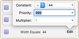
Now, we'll change the priority of our original 44 point width constraint to something less than 1000. We'll use 999 to emphasize the point, but this could be any number from 0 - 999.
Success! Auto Layout now allows our button's intrinsic content size to take precedent over our width contraint:

Now that we understand Compression Resistance, understanding Content Hugging Priority is easy. It works in a very similar manner, but instead of managing whether a view is made smaller than its intrinsic content size, it deals with whether or not a view can be made larger than its intrinsic content size. Let's look at one more example to illustrate this, here's another button:

If we were to add a set of leading and trailing constraints, telling the button to be as wide as the view controller it's sitting on, it might look something like this:

But, if we set the horizontal Content Hugging Priority of our button to 1000, and the priority of those leading and trailing constraints to 999, our **button **becomes nice and small again:

 Tweet
Tweet
 Share
Share
 on reddit