Properly responding integrating with the software keyboard is a big part of building a solid iOS app. Traditionally, this would involve observing NSNotificationCenternotifications and some pretty lengthy boilerplate code. Today we'll look at a great little library from Toto Tvalavadze called Typist that can improve all this. Let's check it out.
Typist works by exposing a way for us to easily "opt-in" to certain keyboardevents:
Typist provides this same interface for a bunch of useful events:
Typist.shared.on(event:.willShow){_in/* TODO */}.on(event:.didShow){_in/* TODO */}.on(event:.willHide){_in/* TODO */}.on(event:.didHide){_in/* TODO */}.on(event:.willChangeFrame){_in/* TODO */}.on(event:.didChangeFrame){_in/* TODO */}.start()}
Finally, inside each event closure, we're given a Typist.KeyboardOptions type that contains strongly-typed properties describing the event:
Here we're guard-ing to make sure the keyboard belongs to our app, and returning early if not.
Then, we use the endFrame property to adjust our own views to accomodate the keyboard.
Neat!
Typist's options type also provides startFrame, animationCurve, and animationDurationproperties to help us match our app's animation to the keyboard's.
Text is a huge part of iOS apps. Today we'll look at one way we can polish up the text in our apps, by allowing it to naturally "flow" around objects. Let's begin.
We'll start with a "before" picture. Here we've got a basic setup with some text and an image in the top right corner. Nothing too fancy here, just a regular UITextView and UIImageView:
letimageView=UIImageView(image:UIImage(named:"steve"))lettextView=UITextView(frame:.zero)textView.text="Here's to the crazy ones..."
This looks fine. But our text is needlessly narrow. It'd be great if we could make the textexpand to the full width of the device. We'll change our Text View's layout so it does:
Well, we're getting closer. Now we just need a way to make the text"flow" or "wrap" around our image. We'll start by getting the frame of the image view, then we'll create a path from it:
letimagePath=UIBezierPath(rect:imageView.frame)
Finally, we'll set our new path as one of the exclusionPaths of our Text View'stextContainer:
textView.textContainer.exclusionPaths=[imagePath]
Success! Since exclusionPaths is an Array, we can flow text around as many shapes as we want!
UITableView & UICollectionView have some fantastic animation capabilities. We can animate items and sections being inserted, removed, moved, etc. We've all been there though, reloadData is sitting right there, and is conceptually so simple. Wouldn't it be great if we could enable those fancy animations in our views, with the conceptually simplicity of reloadData?
Today we'll check out Dwifft, a library from Jack Flintermann that can help us achieve this. Let's dive in.
We'll begin with a regular UITableViewController. (Dwifft works just as well on UICollectionViews).
First we'll need a TableViewDiffCalculator. This is a generic type, so we'll tell it that we're going to be display a bunch of Strings.
Next we'll initialize our data with some random items (just a randomly ordered array of Strings). We'll also use a property observer to let our diff calculator know whenever our items change.
Alerts have been around since iOS was iPhone OS. First in the form of UIAlertView, and now through UIAlertController (Bite #44). The built-in system alerts work great, but sometimes we want something fancier 🎩. Today we'll check out PMAlertController from Paolo Musolino, a library that allows us to easily display great looking alerts in our app. Let's take a look.
PMAlertController is essentially a fancier replacement for the styles that UIKit'sUIAlertController already provides.
The "Alert" Style is 270 points wide (matching the system's alerts):
The "Walkthrough" Style is almost the full width of the screen and is appropriate for more in-depth alerts/dialogs (such as those for explaining why our app is requesting permission for some of the user's data):
We're given a title, description and image to work with:
letalertVC=PMAlertController(title:"Locate your device",description:"Enables access to your...",image:UIImage(named:"flag.png"),style:.alert)alertVC.addAction(PMAlertAction(title:"Cancel",style:.cancel,action:{in}))alertVC.addAction(PMAlertAction(title:"Allow",style:.default,action:{in}))present(alertVC,animated:true,completion:nil)
We instantiate the view controller, add some actions (each with their own closure handler that will be called when the action is tapped), and present it.
Neat!
Libraries like PMAlertController can help us easily add some polish to our apps, but they can also be a great way to learn about creating custom controls in general.
We've looked at protocols in Swift in Bite #232, but we haven't really seen a ton of "real world" examples. Today we'll check out a library called CostumeKit. It's a set of base protocols that can assist us in visually styling or "themeing" our apps. Along the way we'll use some protocols "for real". Let's jump in.
Author's Note: Full disclosure, CostumeKit is written by me. I'm a huge fan of conventions, also it's a nice basic example of Protocols. I use it in all my apps.
To try this out, we'll be working on an imaginary Little Bites of Cocoaapp.
We're almost there, next we need to create the actual Costume our app will wear. For this we'll implement one more protocol. This protocol has no requirements. It serves as more of a convention really.
For good measure, we'll define a night-mode costume as well:
openclassLittleBitesNightCostume:LittleBitesCostume{publicoverridefunccontentTextColor()->Color{returnColor.white}overridepublicvarname:String{return"Night Mode"}overridepublicvardescription:String{return"For reading in the dark."}}
That's where CostumeKit stops. We get a super-tiny bit of functionality "for free" (fonts, color parsing), but the idea is that we're merely following a set of conventions to help guide us through writing this code.
Let's finish up by looking at how we might actually use costumes in our app. Everything from this point on would live inside our app's code (and isn't part of CostumeKit).
We'll make a Wardrobe type and static instance to manage all our costumes:
importCostumeKitpublicclassWardrobe{private(set)varcurrent:LittleBitesCostumeinit(initialCostume:LittleBitesCostume){current=initialCostume}publicfuncchange(costume:LittleBitesCostume,animated:Bool=true){// TODO: In the future, we'll animate this change using UIView transitions and RxSwift.current=costume}}publicletwardrobe=Wardrobe(initialCostume:LittleBitesCostume())publicvarcostume:LittleBitesCostume{returnwardrobe.current}
Now in our regular UIKit code, we can use our current costume:
With the iPhone 7 and iPhone 7 Plus, Apple added a remarkable new piece of hardware to our devices. It's called the Taptic Engine and it is a big change from the old vibration feedback mechanisms we're used to. Today we'll look at how we can use it in our apps. Let's get started.
Haptic feedback on iOS is all about subtlety.
We want to help inform and/or guide the user, not annoy them. For these reasons, Apple has provided a few different classes we can use to generate haptic feedback that matches what we find around the system.
First up, UIImpactFeedbackGenerator. This is great for more prominent user interactions like when a part of our UI "snaps" into place (for example, imagine a drawing app that snaps when you drag over the exact center of the document).
Next, UISelectionFeedbackGenerator. These are perfect for small, subtle changes in selection. We can preview this one by 3D Touching on an app's icon on the home screen (one with a few 3D Touch shortcuts). If we keep our finger down and drag between the menu items, we'll feel the slightest "click" as we change selection. Neat!
Last, we have UINotificationFeedbackGenerator. These are pretty heavy and are meant for things like errors or warnings. (Imagine a login form that uses this generator when the user enters an incorrect password).
Now, lets try this out in code. First we need to instantiate a generator, and call the prepare function on it.
The prepare function is crucial here. It has to do with the physical hardware inside the device.
Basically, prepare will "wake up" the Taptic Engine hardware and put it into a state where it's ready to generate feedback immediately when we ask it to. iOS is relentless about saving battery and power. The Taptic Engine isn't always using "full" power, and only does so for a few seconds after the prepare function is called. Neat.
Things will still work if we don't call prepare, but they might not perfectly match up with the changes on screen (another crucial part of crafting effective Haptic feedback).
Now all we need to do trigger the actual haptic to "play" is:
generator.selectionChanged()
Each generator has its own function for "playing" the haptic. (i.e. impactOccurred, selectionChanged, and notificationOccurred, respectively).
Finally, let's look at a "complete" example using a gesture recognizer:
vargenerator:UISelectionFeedbackGenerator?=nilfuncpanned(_sender:UIPanGestureRecognizer){switch(sender.state){case.began:generator=UISelectionFeedbackGenerator()generator?.prepare()case.changed:ifselectionChanged(translationPoint:sender.translation(in:view)){generator?.selectionChanged()// we call prepare again right after "playing",// to make sure the taptic engine is "ready" if the user// moves their finger again quickly.generator?.prepare()}case.cancelled,.ended,.failed:generator=nildefault:break}}
Tab Bars have been around since the very first iPhone. They are a fantastic way to organize the top level screens in our app, and give users a quick way to get to each. Today we'll check out the latest improvements to how e can customize the look and feel of UITabBars in our app. Let's begin.
First up: Badge Customization.
For years we've had to resort to custom drawing or other methods to change how the badge would appear on a tab bar in our app.
In iOS 10, Apple has added a couple of features to allow us to completely customize how this looks with only a few lines of code.
Let's try this out. First, we'll set a badge value on one of the tabs:
The .lightContent style lives up to its name, as it makes the status bar'scontent white.
This work great until we put our view controller inside a navigation controller. Overriding the property then has no effect, as the system is actually asking the navigation controller.
We've all been here:
Yuck. Let's fix that up.
Since our content here is in a navigation controller we can use a "tried and true" approach that involves simply subclassing UINavigationController:
To make this work, we can set this custom subclass in Interface Builder, or use it when creating our UI in code. Let's have a look now:
Nice.
This approach works in our case, but might not be the best way to do this. If the navigation bar ever gets hidden, UIKit will actually start asking the containedview controller for the status bar's style, which may or may not be what we want.
We could have accomplished the same thing using a plain old UINavigationController by simply setting its barStyle property when we create it (or by setting this property in Interface Builder) to the .blackOpaque style:
UIPasteboard is a wonderfully simple little type with a ton of great functionality inside. (Covered previously in Bite #45). Today we'll check out the latest pasteboard improvements in iOS 10. Let's begin.
The biggest new user-facing feature of pasteboards in iOS 10 and macOS Sierra is the Universal Clipboard. This allows users to copy some content into their clipboard on one device, and retrieve it on another.
We don't need to do anything to get this functionality in our apps. This behavior is on by default for UIPasteboard.general, but we can configure how items behave when we add them.
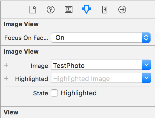
When using UIImageViews, sometimes the built-in content modes can cramp our style.
Many times, we're displaying photos of people. In these cases, it'd be great if the image view could somehow be told to intelligently crop the photo around the person's face.
AspectFillFaceAware is essentially just an extension on UIImageView. It provides two ways to configure an image view to be "face aware".
The first is in Interface Builder, we can enable the feature by flipping on the feature in the Inspector. (Not seeing the option? Run your project once, then it should appear).
Here's the how it looks:
We can also enable the functionality in code by setting the image view'simage using this new function:
imageView.set(image:avatar,focusOnFaces:true)
We can even throw a quick corner radius on the image view'slayer to try out the "face aware" functionality on a circular view. (i.e. user avatars):
Under the hood, the library is using a low accuracy CIDetector with a type of CIDetectorTypeFace to handle the actual face detection. Want to dive deeper here? We covered CIDetectors way back in Bite #87.
More info about AsyncFillFaceAware can be found at git.io/faceaware